Grid Container. A Grid Container is any element with its display property set to grid. In a single view, or single document in the browser, we can have as few or as many grid containers as we like, and we can also nest grid containers inside other grid containers.
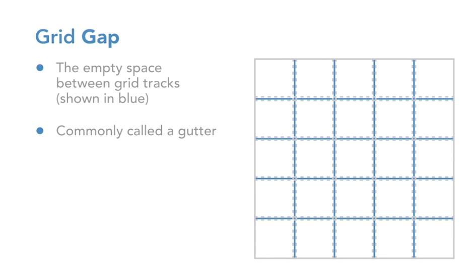
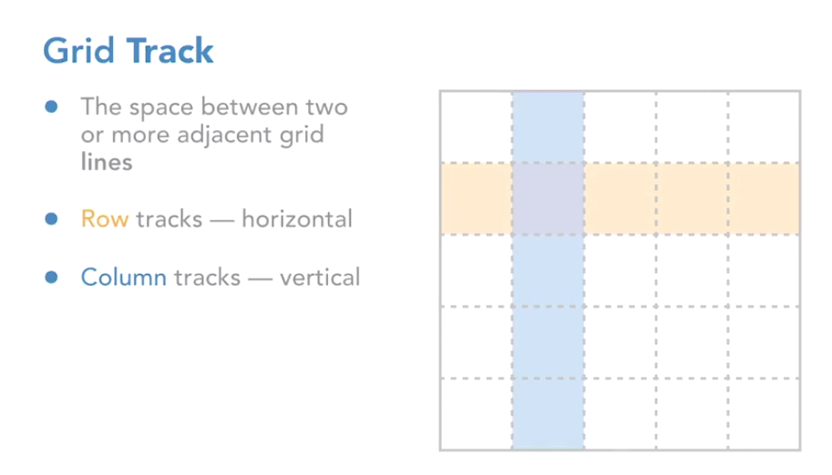
A grid track is the space between two or more horizontally or vertically adjacent grid lines. The row track is horizontal and the column track is vertical. The grid area covers one or more cells. The purpose of the grid area is to define the grid area that can be referenced when placing grid items. Finally, grid lines have no width by default, which means that each grid line is relative to the next grid line. Grid gaps create a uniform gutter between each track, and you can choose to define column gaps, row gaps, or column and row gaps. Keep in mind that when we use grid tracks, we are actually creating a blank space between each grid track, which in turn means that any colors or items appearing behind the grid will now pass through this grid The gap glows.
 Vincentmedia